Summer Painting Season 2026


5 June - 21 August 2026
Our season of Summer Painting sessions run from Friday 5 June through to Friday 21 August. The cost is £5 per session and everybody is welcome. You will find us at the Crowborough Community Centre, downstairs through the cafe area in the first meeting room on the right. Sessions run from 9.30am through to 12.00pm.
Sessions are informal and fun where we work on our own projects in the company of like-minded people. You don't have to be a member of our group to come along - everybody is welcome.
Coffee or tea is available from the self-serve area of the cafe or you can bring your own.
April 2026


Frank Walters enjoyed a successful career in advertising from art school before turning to teaching watercolour painting five years ago. He is passionate about teaching people to paint atmospheric landscapes, to convey impression and mood as opposed to technical detail. His key principle is “Don't be a slave to what you see, be the master of what you want”. It is your view of what you are looking at that matters. To show this principle in practice, Frank used two photographs of Ashdown Forest as his subject for this demonstration.
He prefers to use 140lb paper, NOT pressed Saunders Waterford or Arches, and he makes the preliminary drawing with a paintbrush as opposed to pencil. He explained how drawing in pencil and filling with paint can lead to dead paintings that lack the energy that goes straight onto the paper when working directly with paint. He works his paintings in stages: firstly planning and developing the composition by applying light colour washes followed by mid tones which form the heart of the picture. Finally, dark accents, shadow washes and details are added taking care to preserve light areas either by leaving some clear areas of white paper or by using white paint.
For the two paintings in his demonstration, Frank used artist quality paints made by Rembrandt, Schminke and Daniel Smith. He prefers to use tubes which he squeezes into empty pans because the paints are softer and kinder to brushes. His colour selection included Cobalt, Cerulean and Raw Sienna for the sky. Greens for ground cover and foliage were mixed from Raw Sienna, Olive Green and Cobalt Blue enhanced with Burnt Sienna and Cadmium Red. Tree trunks in Burnt Sienna and Cobalt Blue. Shadow washes were added using a mix of Alizarin Crimson and French Ultramarine. Frank also recommended Sepia as a good dark colour to use.
Light washes in greens and raw sienna created a background depth for the mid tones. Darker details were drawn on top, using the point of the brushes in a calligraphic way leaving light coloured spaces to allow contrasts around the brush marks. Frank gave a few general tips that darks should be applied at the end of the painting and warmer, darker tones should be more to the front of the picture to bring them forward. Paler washes recede and create depth.
Frank spoke about his choice of brushes: Kolinsky Sables (size 6 & 12) as his preference but also experiments with other makes of these sizes, including Rosemary and da Vinci. Useful for landscapes is a No.1 mop, a No.3 rigger and a 1.5 inch flat brush for washes.
The main message from Frank's demo was to have fun.
March 2026


Our thanks to Georgina Moir for an instructive watercolor tutorial. The subject for this session was a kingfisher, puffed up with its orange breast and its feathery blue head, back and wings sitting on a branch. Georgina recommended a limited palette of watercolors – sap green, alizarin crimson, cerulean and cobalt blues, paynes grey, cadmium red and yellow, burnt umber and some white gouache.
Working from a photo for reference, Georgina started with a light pencil drawing on watercolor paper, the painting was then created in stages allowing for the paint to dry between subsequent layers. The order of the work was to initially paint all parts of the bird in light color washes, then, working around the subject, once it was dry, increasingly adding pigment with brushstrokes showing the feather patterns and shadows. Paynes grey was mixed in with orange and blue to create shadow and detail the feathers. The details around the beak and face of the bird needed careful work with a small brush. Tiny dots of gouache were added to the eye and the top of the head and brushed on the wings to create highlights.
Georgina used wet on wet technique (damp paper with pigment dropped in lightly) to keep things soft on the main body of the bird. The more textured wings and the details of the head, which needed more control, was applied wet on dry. Finally, dry brush technique, using dried paint while the paper was still slightly damp helped to create more texture in the feathers. This was a lovely subject where the complementary colours and different textures and shapes produced a very satisfying result. Thank you Georgina.
February 2026


When we saw the list of materials needed for Mark Fisher's session, we were expecting something unusual. The subject was to be a heavily textured picture of dilapidated boat hut on a pebble beach somewhere on the Rye coast. Among the materials we were asked to bring were PVA glue, dry filler powder, various seeds (chia seeds, quinoa, split lentils etc) bits of wood, cardboard and mixing cups. We also needed to bring our usual acrylic paints plus a sturdy board (primed) for the base of the picture. Paper or thin card as a base does not work for this type of project.
Many varieties of PVA based textured pastes are available from art suppliers but Mark gave us the useful tip that mixing our own is a cheaper alternative and can be just as good.
The first of two sessions was used to build the picture base, mixing and applying textures, rougher and larger in the foreground, receding to smoother and smaller in the background to give an impression of perspective. Various seeds were mixed with PVA and applied with a pallet knife to provide the pebbled texture of the beach and pieces of card or thin wood added for the breakwaters and the boat hut. The dry filler mixed into PVA provided a sand-like texture for the smoother parts of the beach. To ensure everything was stuck down, a coat of PVA was applied over the whole base after it had been given time to dry. After that, the beach was given an acrylic undercoat of yellow ochre/white mix and the sky in dark grey.
The second session started with a preparation technique often used by model makers. Diluted black paint (or acrylic ink) was painted over all areas apart from the sky. This brings out the detail of pebbles and wooden features by flowing into the recesses of the textures, bringing out shadow detail without overwhelming the mid-tones. Once thoroughly dry, highlights were added by dry-brushing with a flat brush held at a flat angle using progressive lighter blends of white, yellow ochre and burnt sienna. Dark colours were used to reinforce areas of shadow and wooden features. A dramatic grey sky was painted with dark colours, clouds added by scumbling small amounts of white paint. Aerial perspective was emphasized by painting the clouds smaller and thinner as they approached the horizon.
This was a most unusual session as well as being a lot of fun. Our thanks to Mark Fisher.
October 2025


For the first of two tutorials by Graham Lock, Graham provided a demonstration of how to paint an autumn woodland landscape with sun rays in water colours. This was followed up with a practical step by step tutorial during which we painted along in stages using a limited colour pallet to create an autumnal scene of a lake and trees. Graham showed us how to paint trees by dropping colours loosely onto a wet surface, letting the water do the mixing. Our thanks to Graham for another informative and productive session.
September 2025

Our thanks to local professional artist Katharine Jennings for another informative session. For this tutorial, Katharine chose a picture of a spaniel as the subject for a portrait using a mixture of soft pastels and pencils on pastel mat paper.
She started by outlining the portrait with straight lines following the photograph as a reference. She then blocked in the dark areas using soft stick pastels in dark brown then dark blue and a tan colour for the lighter areas. These were blended together with a blending stump using fine sandpaper to clean the point as she went. Next the eye was painted using pastel pencils keeping the reflective areas clear.
Texture of the fur was applied with pastel pencils following the direction of growth in varying degrees of detail. The last stage involved correcting any mistakes and adding final points of detail.

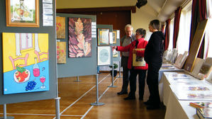
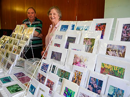
CRAG Art Exhibition - 28 April to 28 May 2025


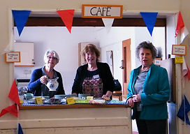
Our thanks to the staff at the Crowborough Community Centre and everybody who supported our CRAG Art Exhibition throughout the whole of May 2025.
Over 20 members of the art group displayed drawings and paintings, many for sale, and there were cards for sale too.
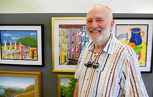
CRAG is the longest running art group in Crowborough (dating from the 1950s) and is still going strong with over 40 members. It is a friendly and sociable group and when it has membership vacancies it is easy to join. Many of the artists are well known in the area. The group invites professional artists to run demonstrations and workshops for 8 months of the year and meets in Crowborough Community Centre to paint together in the summer months. These Summer Painting sessions are open to non-members.
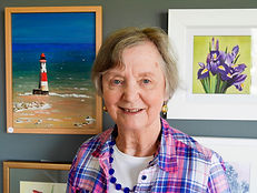
Highlighting some of the members, Sheila Winter has spent a lifetime riding and she puts all this experience into her marvellous equestrian paintings. She conveys a real sense of the character of horses and their muscular beauty. Mary Bradley is a popular artist for commissions and her paintings of local subjects and places. Mike Thompson is inspired to paint landscapes by the light, colours, textures and sheer beauty of mountains and moorland and especially the Ashdown Forest and the fells of the Lake District, which he visits frequently. Cliff Richardson is a watercolourist of landscape and seascape, who presents his work in a realistic way, aiming to enable the viewer to feel they are really experiencing it. Our exhibitions are intended to have wide appeal across different subjects and media and we have been very pleased with the interest shown this year and the favourable comments we have received. Thank you for your interest in our work.
January 2025
Mark Fisher showed us how to combine a big sky with a landscape to make a very arresting subject whose depth pulls the eye in immediately. Aerial perspective was the key to the composition with larger clouds at the top and larger and warmer landscape elements at the bottom and everything else becoming smaller towards the horizon. The off-centre focal point on the low horizon is where the sky meets the landscape in a lighter area of sky. The clouds were angled down leading the eye to the tiny clouds on the horizon. The landscape below was sea and land with a curved edge of a bay and curved landscape lines meeting the sky.
Mark used a limited palette of pthalo and cyan blues, white, yellow ochre and burnt umber. The sky was painted in the blues and white with gently blended parallel brushstrokes, minimum water, with the blue fading to near white at the horizon. While the paint was still wet he used a round hog hair brush with a rotary, scumbling motion to add the clouds, using the principle of the larger clouds at the top of the work, halving in size in each layer until the horizon comprised layers of tiny clouds. A mix of a blue and burnt umber was used to add grey areas to the lower parts of the clouds and higher parts were highlighted with white. Delicate brushwork vital.
The horizon to the sea was masked to keep it straight. The sea was painted in parallel sweeps of the brush with some waves added, growing smaller towards the horizon but marking the beach edge with white in the foreground.
Mark also demonstrated how to produce much looser sky versions using a 1 inch flat brush with more random, all-directions brushstrokes and another version using a thick round ‘shaving brush’ type. For looser work use of fingers, rags, an atomiser, can all be helpful. Great results!


November 2024
Our thanks to Josie Tipler for another enjoyable session. Josie’s subject this time was a strong, vibrant acrylic painting of the Smoky Mountains in the USA. This featured a vast landscape across miles of mountains. Using strong warm colours in the foreground and cool colours to create distance was the guiding principle, using little water. We started with a strong pink ground and then applied paint over it with a half inch brush, layering in the sky with cerulean blue, lemon and white and then adding the mountains with sweeping curving strokes in Prussian blue and white to create recession into the distance. Blending was needed to make the distant mountains soft and hazy. Nearer mountains were deep violet. Dry brushwork was needed for the foreground trees and twigs against some of the initial pink ground. This was an exciting and dramatic painting and very enjoyable to tackle.

November 2024


Graham Lock’s subject this time was creating mood in watercolour. He painted four landscapes, one for each season, on one large sheet of paper at an easel. He used a palette of only five colours and moved between the four paintings to allow them to dry. Some of his tips for success in watercolour were that tonal contrast does most of the work and colour is icing on the cake. He stands to paint so that he works from the shoulder not the wrist and when working from a photo makes a sketch first to guide the drawing for the painting before hiding the photo away. He also reminded us that trees lean, gate horizontals should be incomplete because that is generally how we see them and he always paints his birds in the sky pointing towards a centre of interest. Our thanks to Graham for a mesmerising session.


April 2024
A welcome return visit from Graham Lock took us through a step by step tutorial using the rural landscape shown here. This was a study in water colours using a mix of wet-on-wet and wet-on-dry techniques to produce various effects in light and shade. Our thanks to Graham for another instructive session.

April 2024
Our thanks to Jan Moffitt for giving us an instructive step-by-step tutorial in portraiture. Jan's chosen media included charcoal and pencils with loose watercolour washes. She explained how to proportion the facial features and how to apply shade to get the right effect. A very enjoyable and highly informative class.

March 2024
Our thanks to Elaine Almond for running an interesting demo of her practice of abstraction in landscape. She explained how to collage preparatory sketches into a coherent artwork and then how to develop it further into a finished painting. She also gave us numerous tips on such things as using twigs with ink and how to tear painted paper without exposing a white edge.

February 2024
Mark's theme this time was a semi abstract in acrylic, adding a variety of textural features using a mix of PVA, fillers and elements of collage. Several types of textural mediums are available from art suppliers but Mark suggested all kinds of ways in which we could make our own using PVA mixed with with such things as torn paper, coffee grounds etc. Experimentation is the key. Our thanks to Mark Fisher for running another unusual and fun session.